Pantone 2026: Soft, Muted, and Financially Stressed.
Pantone’s 2026 Color of the Year reads less like a trend forecast and more like an economic diagnosis. The shade — soft, muted, and quietly comforting — feels like the visual equivalent of budgeting without fully surrendering personal style. It’s aspirational, but only in the way people now aspire to stability, restraint, and things that won’t feel irresponsible six months from now. If it feels recession-coded, that’s because it is.
Pantone has always mirrored the cultural mood, but this year’s choice lands differently. There’s no exuberance, no maximalist optimism, no attempt to manufacture hope. Instead, the color occupies the emotional middle ground between practicality and desire: warm enough to feel human, neutral enough to feel financially sound. It reassures rather than excites — a soft-landing color for uncertain times.
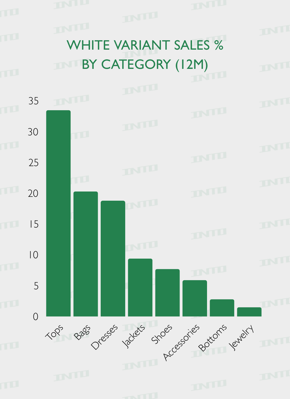
That sentiment is already visible in consumer behavior. Over the past 12 months, sales data shows white and near-neutral color variants dominating key product categories, with tops, bags, and dresses leading overall volume. These aren’t impulse pieces; they’re wardrobe anchors. Items meant to be worn often, styled repeatedly, and justified as “worth it.” The color thrives where longevity matters most.
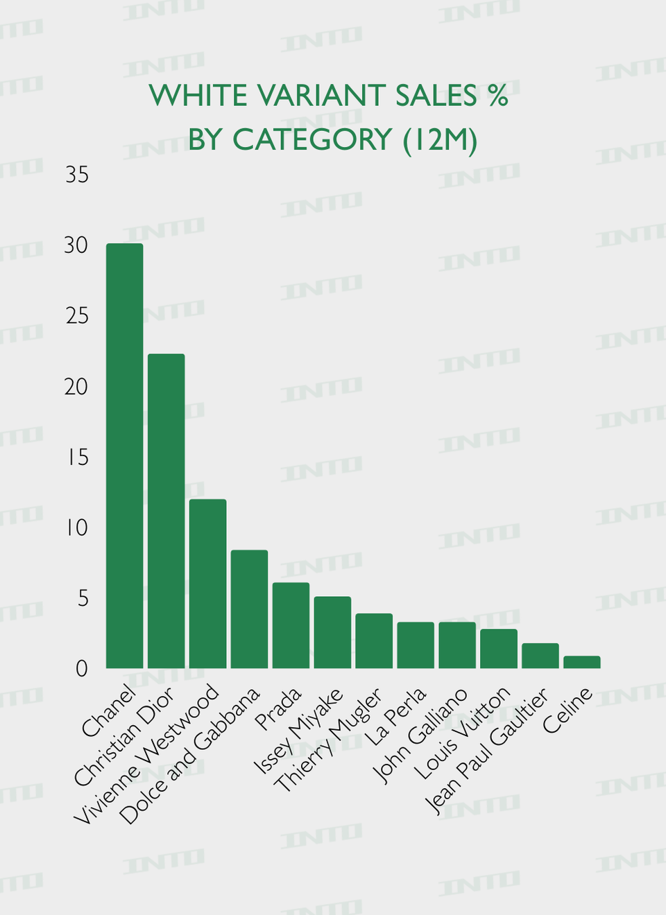
The same pattern appears at the brand level. Chanel, Dior, Vivienne Westwood, Dolce & Gabbana, and Prada lead sales in white and neutral variants — heritage houses whose signatures already signal durability, resale value, and timelessness. In other words, when consumers are spending carefully, they’re gravitating toward brands and colors that feel like safe bets, not seasonal risks.
Historically, economic downturns push fashion toward restraint: quality over quantity, durability over novelty, and nostalgia over experimentation. Pantone’s 2026 shade fits neatly into that lineage. It recalls ’90s camel coats, early-2000s structured handbags, and knitwear designed to outlast trend cycles. Even visually, it photographs as calm and composed — a color that won’t feel dated by the next market wobble.
Fashion rarely admits it outright, but the prevailing mood is frugal chic. Consumers are tired — financially, emotionally, aesthetically. Even luxury shoppers are recalibrating, favoring pieces that signal discernment rather than excess. Pantone didn’t just choose a color; they took a temperature check. And that temperature is cautious, controlled, and intentionally understated.
Yet this is where the color becomes interesting. It looks expensive without demanding an expensive lifestyle. It pairs seamlessly with vintage leather, elevated basics, and archival fashion — precisely the categories outperforming in resale. It’s recession-core, but polished. A form of quiet luxury that actually aligns with how people are spending now.
It offers the illusion of stability, even if reality feels less certain.
Whether you love or hate Pantone’s 2026 pick depends on what you want from a Color of the Year. If you’re looking for escapism or fantasy, this isn’t it. But if you want emotional accuracy, cultural relevance, and real-world wearability, it’s hard to deny its precision.
2026 doesn’t need a color that shouts. It needs one that holds steady — and in that sense, Pantone got it exactly right.